I was recently going through some pictures I had taken on vacation, and wanted to share them with family. As I had been shooting in RAW mode with my Nikon D5200, my filesizes were huge (around 27mb per image) and I was hoping to get that down a bit before sharing.
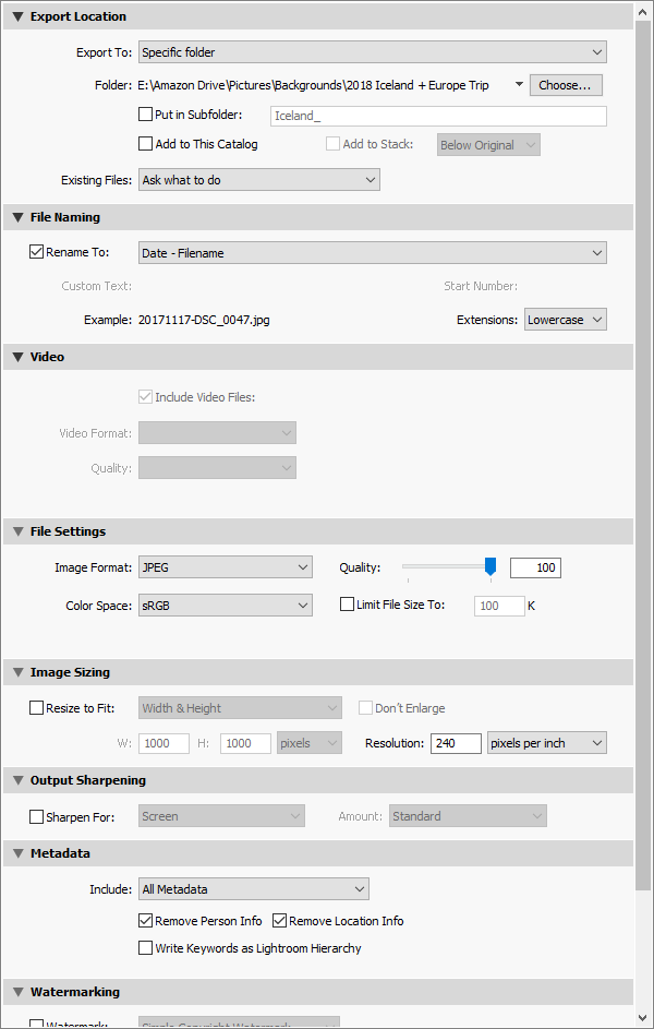
At the end of doing some quick adjustments in Adobe Lightroom CC, I was navigating my way through the Export Options. There it is below, definitely a bit of a rat’s nest.
Midway down, the quality slider caught my eye. I had no basis for what quality I really needed to export my pictures at to hit a good balance of quality/storage space. I knew that JPG compression can result in artifacts and loss of image fidelity, but how far could I push that slider before I really started to notice?
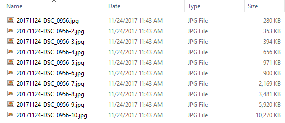
I decided to take the same image, and export it ten times at 10% quality intervals, and compare the results.
Here is the 100% quality version, for reference:

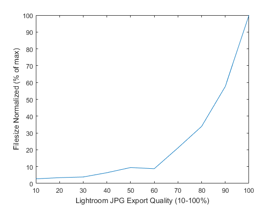
And here are the resulting filesizes, at each 10% quality interval. I’ve graphed them below on a simple plot, the first graph showing the real file sizes and the second normalizing them on a 0-100 scale.
These results really surprised me, at quality levels below 60%, the filesizes were all within 10% of the maximum quality. So essentially, moving from 10% quality to 60% quality got you a “free” 50% quality boost for minimal filesize hit.
Here’s the 10% quality image presented first, and then click to the right to switch to the 100% quality image.
The first real spot in the image I noticed the compression was in the reflection of the can, I’ve placed them side by side here:
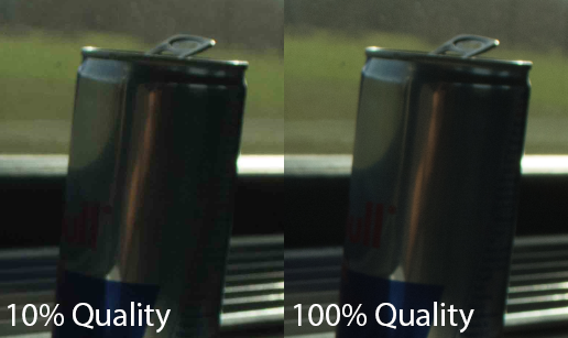
The compression is really visible in the top left portion of the can, where there are some definite artifacts in the large lighter silver portion.
I also really noticed the compression in my spare battery case:
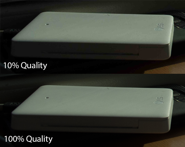
The large white area seemed to really suffer from the lower quality compressions, as you can see pixelization all over the top of the case.
The third and final place I really noticed it was in the text on my journal. The 10% quality really degraded the quality of the text, and compression artifacts were visible in the white page.
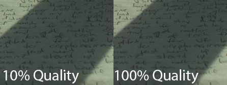
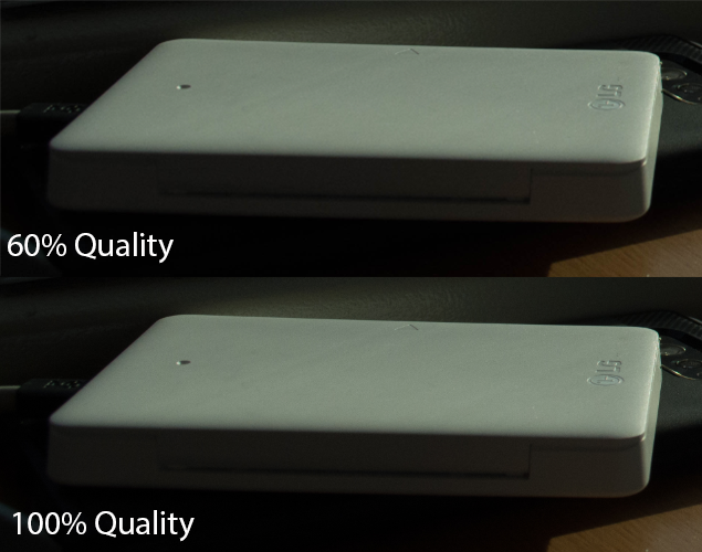
Even with these quality differences visible, this is between 10% and 100%, but at we saw in those graphs, 60% quality is still only 8% of the full filesize. Can you notice the difference between 60% and 100% here? I can still slightly see the extra compression in the 60% version, but it’s so close. Much closer than 10% vs. 100%, in my opinion.
Thanks for reading through if you’re still here, leave any questions in the comments!

